
2021
SafexPay
Cohesive fintech identity and interface branding across platforms and touchpoints, including web, mobile, wearables, and white-label product integrations for financial institutions and partners.
Brand Guideline
Fintech
Know More
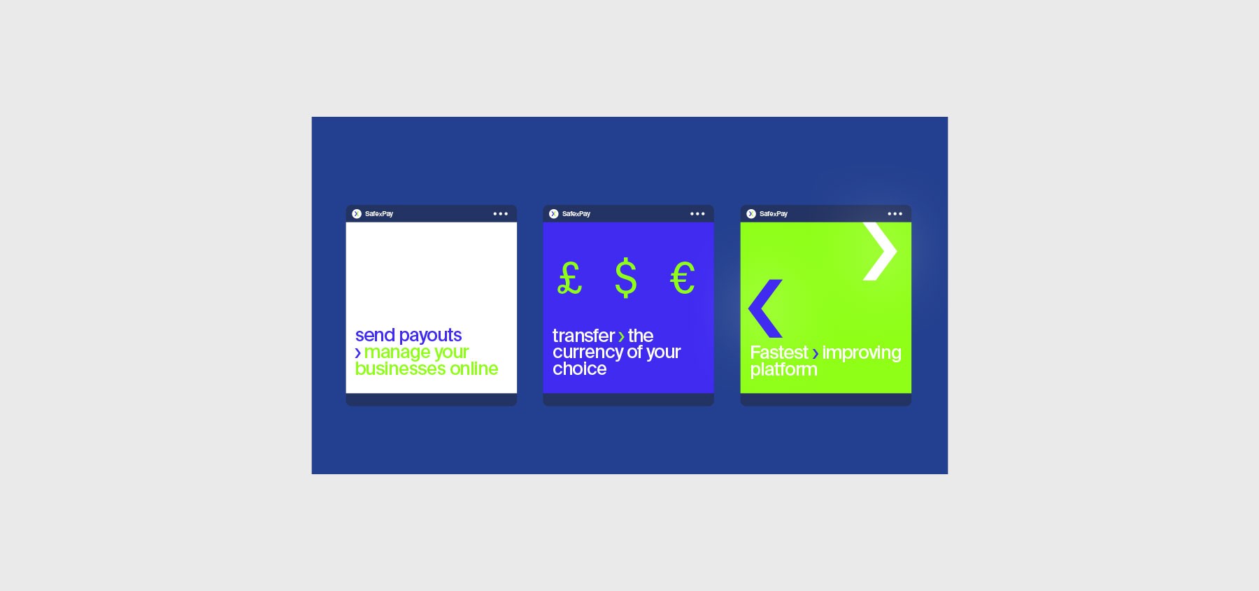
I created the Safe X Pay brand guidelines, covering visual identity, logo assets, icons, and app branding. From concept to execution, I built a scalable identity system optimized for cross-platform performance. This included logo design, iconography, mockups, and brand color direction based on Pantone, ensuring consistency across digital, print, and wearables.
Identity Design System
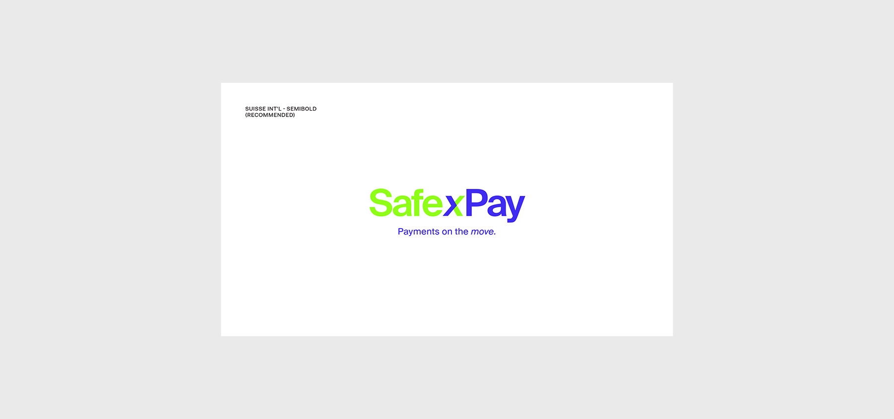
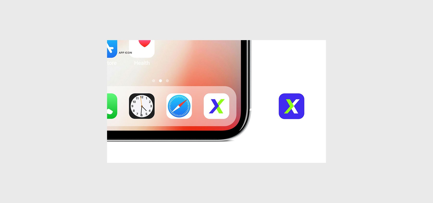
I designed the full logo system and primary app icon in Adobe Illustrator, keeping fintech simplicity and trust at the core. The main brand statement, “payments on the move,” was integrated with a bold logotype designed to feel dynamic and global. Variations were created for web, mobile, wearables, and digital wallets, each tested across backgrounds for optimal legibility. All logo files were exported as AI, EPS, and SVG, with text converted to outlines for production readiness. The system was also optimized for responsive sizing, high-contrast applications, and real-time fintech UI integration.
Color Strategy & Pantone Use
Color Strategy & Pantone Use
Meaningful, modern color palette guided by Pantone swatches and fintech psychology, with balanced tones to support both corporate and consumer-facing digital environments.
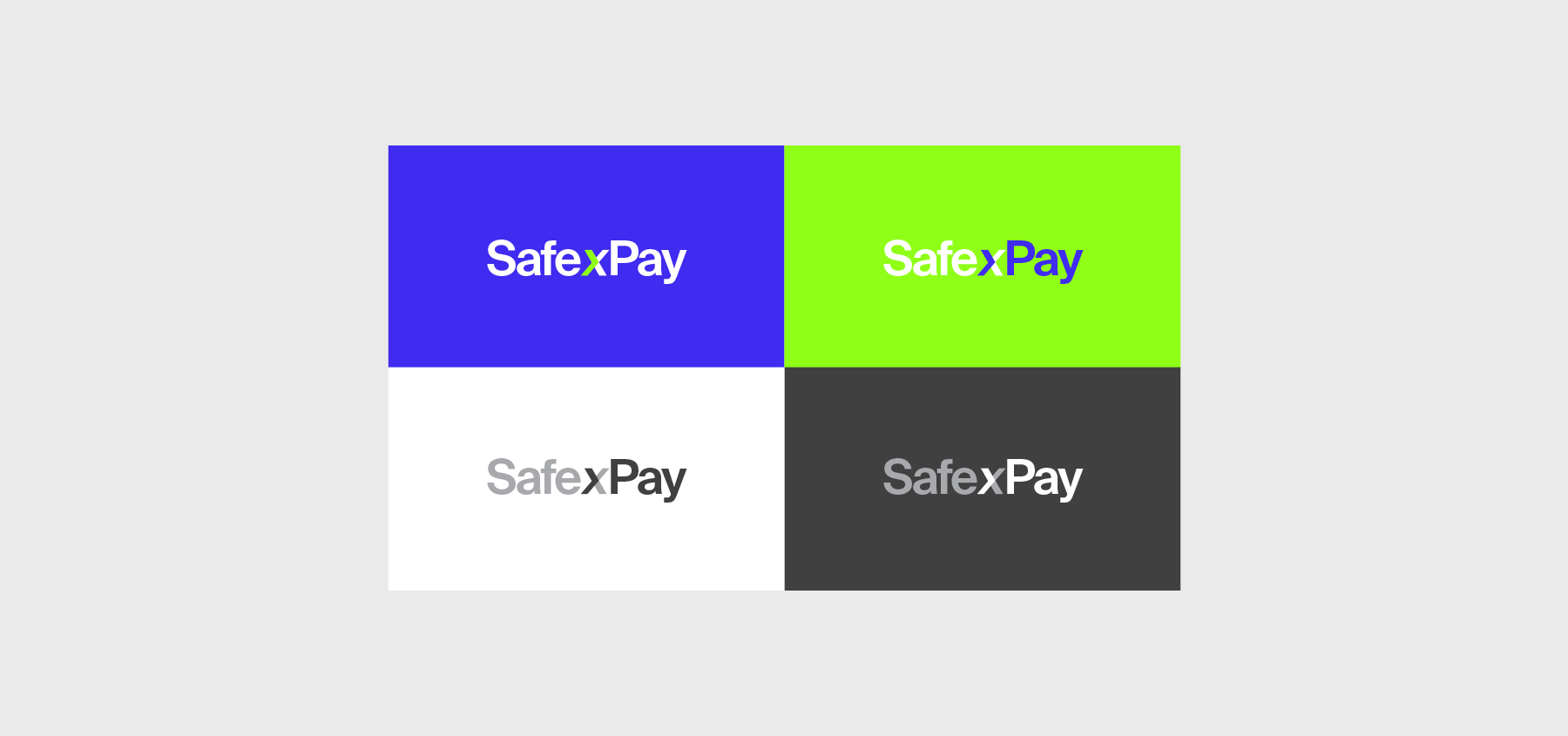
The Safe X Pay color system was built using the official Pantone color book, translating intent into color values. For example, Blue represents technology and forward motion, while Green signals eco-awareness and sustainable direction. These colors formed the Exchange Device palette and were chosen to reflect movement, clarity, and trust. The color guide covered RGB, CMYK, HEX, and Pantone references, ensuring consistent use across all digital and print assets. Color contrast was tested for accessibility and visual clarity on light and dark backgrounds.


Fintech-Centric Iconography
Fintech-Centric Iconography
Scalable icons, currency visuals, and feature symbols crafted in Illustrator, optimized for fintech storytelling, UI applications, and multi-device consistency.
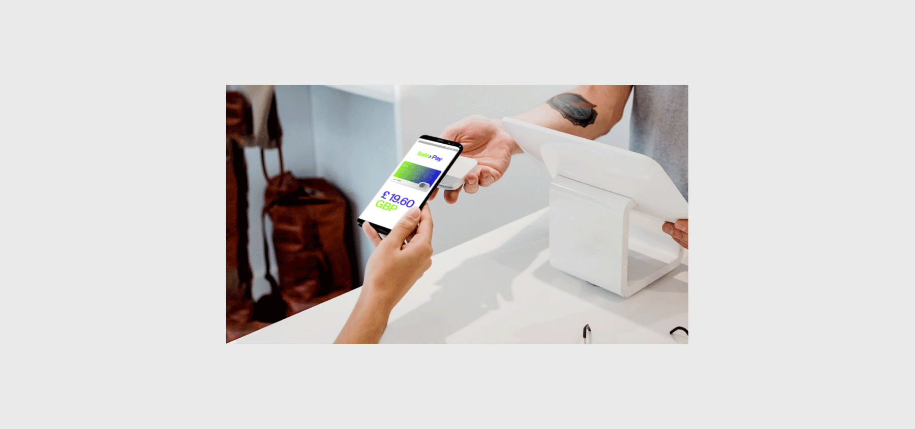
I designed a bespoke icon system under the “3.0” visual style, covering themes such as communications, currency exchange, fast money, and multi-location transfers. These icons were created in vector format for scalability and used to explain features like London to New York transfers in seconds. The iconography was applied in app screens, infographics, and wearable mockups. Adobe Photoshop was used to retouch, resize, and integrate them into real-life usage scenarios. Each icon was designed for maximum legibility across retina screens, apps, and printed guides.
Purpose of Brand Guidelines
Purpose of Brand Guidelines
Essential rules for consistency, trust, and scalable design across all departments, vendors, and evolving digital platforms.
Brand guidelines aren't just a visual asset, they're a strategic tool. They ensure consistent application of your identity across internal and external channels, reduce design errors, and streamline creative output across departments and vendors. For fintech brands like Safe X Pay, clarity, trust, and digital precision are non-negotiable, and strong brand documentation guarantees that every future product or campaign feels like one connected voice. These guidelines also act as a training and onboarding resource for future creative teams, tech developers, and partners.
More Works
©2004 - 2025
More Works
©2004 - 2025


FAQ
FAQ
01
What is your design experience?
02
What design disciplines do you specialize in?
03
How do you approach design challenges?
04
Do you use AI tools in your design process?
05
What tools do you master?
06
How do you stay innovative in design?
07
Why should clients choose you?
08
How can we get started?
2021
SafexPay
Cohesive fintech identity and interface branding across platforms and touchpoints, including web, mobile, wearables, and white-label product integrations for financial institutions and partners.
Brand Guideline
Fintech
Know More
I created the Safe X Pay brand guidelines, covering visual identity, logo assets, icons, and app branding. From concept to execution, I built a scalable identity system optimized for cross-platform performance. This included logo design, iconography, mockups, and brand color direction based on Pantone, ensuring consistency across digital, print, and wearables.
Identity Design System
I designed the full logo system and primary app icon in Adobe Illustrator, keeping fintech simplicity and trust at the core. The main brand statement, “payments on the move,” was integrated with a bold logotype designed to feel dynamic and global. Variations were created for web, mobile, wearables, and digital wallets, each tested across backgrounds for optimal legibility. All logo files were exported as AI, EPS, and SVG, with text converted to outlines for production readiness. The system was also optimized for responsive sizing, high-contrast applications, and real-time fintech UI integration.
Color Strategy & Pantone Use
Meaningful, modern color palette guided by Pantone swatches and fintech psychology, with balanced tones to support both corporate and consumer-facing digital environments.
The Safe X Pay color system was built using the official Pantone color book, translating intent into color values. For example, Blue represents technology and forward motion, while Green signals eco-awareness and sustainable direction. These colors formed the Exchange Device palette and were chosen to reflect movement, clarity, and trust. The color guide covered RGB, CMYK, HEX, and Pantone references, ensuring consistent use across all digital and print assets. Color contrast was tested for accessibility and visual clarity on light and dark backgrounds.
Fintech-Centric Iconography
Scalable icons, currency visuals, and feature symbols crafted in Illustrator, optimized for fintech storytelling, UI applications, and multi-device consistency.
I designed a bespoke icon system under the “3.0” visual style, covering themes such as communications, currency exchange, fast money, and multi-location transfers. These icons were created in vector format for scalability and used to explain features like London to New York transfers in seconds. The iconography was applied in app screens, infographics, and wearable mockups. Adobe Photoshop was used to retouch, resize, and integrate them into real-life usage scenarios. Each icon was designed for maximum legibility across retina screens, apps, and printed guides.
Purpose of Brand Guidelines
Essential rules for consistency, trust, and scalable design across all departments, vendors, and evolving digital platforms.
Brand guidelines aren't just a visual asset, they're a strategic tool. They ensure consistent application of your identity across internal and external channels, reduce design errors, and streamline creative output across departments and vendors. For fintech brands like Safe X Pay, clarity, trust, and digital precision are non-negotiable, and strong brand documentation guarantees that every future product or campaign feels like one connected voice. These guidelines also act as a training and onboarding resource for future creative teams, tech developers, and partners.
More Works
©2004 - 2025
FAQ
01
What is your design experience?
02
What design disciplines do you specialize in?
03
How do you approach design challenges?
04
Do you use AI tools in your design process?
05
What tools do you master?
06
How do you stay innovative in design?
07
Why should clients choose you?
08
How can we get started?
2021
SafexPay
Cohesive fintech identity and interface branding across platforms and touchpoints, including web, mobile, wearables, and white-label product integrations for financial institutions and partners.
Brand Guideline
Fintech
Know More
I created the Safe X Pay brand guidelines, covering visual identity, logo assets, icons, and app branding. From concept to execution, I built a scalable identity system optimized for cross-platform performance. This included logo design, iconography, mockups, and brand color direction based on Pantone, ensuring consistency across digital, print, and wearables.
Identity Design System
I designed the full logo system and primary app icon in Adobe Illustrator, keeping fintech simplicity and trust at the core. The main brand statement, “payments on the move,” was integrated with a bold logotype designed to feel dynamic and global. Variations were created for web, mobile, wearables, and digital wallets, each tested across backgrounds for optimal legibility. All logo files were exported as AI, EPS, and SVG, with text converted to outlines for production readiness. The system was also optimized for responsive sizing, high-contrast applications, and real-time fintech UI integration.
Color Strategy & Pantone Use
Meaningful, modern color palette guided by Pantone swatches and fintech psychology, with balanced tones to support both corporate and consumer-facing digital environments.
The Safe X Pay color system was built using the official Pantone color book, translating intent into color values. For example, Blue represents technology and forward motion, while Green signals eco-awareness and sustainable direction. These colors formed the Exchange Device palette and were chosen to reflect movement, clarity, and trust. The color guide covered RGB, CMYK, HEX, and Pantone references, ensuring consistent use across all digital and print assets. Color contrast was tested for accessibility and visual clarity on light and dark backgrounds.
Fintech-Centric Iconography
Scalable icons, currency visuals, and feature symbols crafted in Illustrator, optimized for fintech storytelling, UI applications, and multi-device consistency.
I designed a bespoke icon system under the “3.0” visual style, covering themes such as communications, currency exchange, fast money, and multi-location transfers. These icons were created in vector format for scalability and used to explain features like London to New York transfers in seconds. The iconography was applied in app screens, infographics, and wearable mockups. Adobe Photoshop was used to retouch, resize, and integrate them into real-life usage scenarios. Each icon was designed for maximum legibility across retina screens, apps, and printed guides.
Purpose of Brand Guidelines
Essential rules for consistency, trust, and scalable design across all departments, vendors, and evolving digital platforms.
Brand guidelines aren't just a visual asset, they're a strategic tool. They ensure consistent application of your identity across internal and external channels, reduce design errors, and streamline creative output across departments and vendors. For fintech brands like Safe X Pay, clarity, trust, and digital precision are non-negotiable, and strong brand documentation guarantees that every future product or campaign feels like one connected voice. These guidelines also act as a training and onboarding resource for future creative teams, tech developers, and partners.
More Works
©2004 - 2025
FAQ
What is your design experience?
What design disciplines do you specialize in?
How do you approach design challenges?
Do you use AI tools in your design process?
What tools do you master?
How do you stay innovative in design?
Why should clients choose you?
How can we get started?