2023
Hoosh Cars
This project involved crafting a bold identity through the strategic use of layered mockups, vibrant icon systems, and high-impact layouts. The distinctive Tusker Grotesk typeface was central to defining its visual character.
Media Kit
Digital & Print
Know More
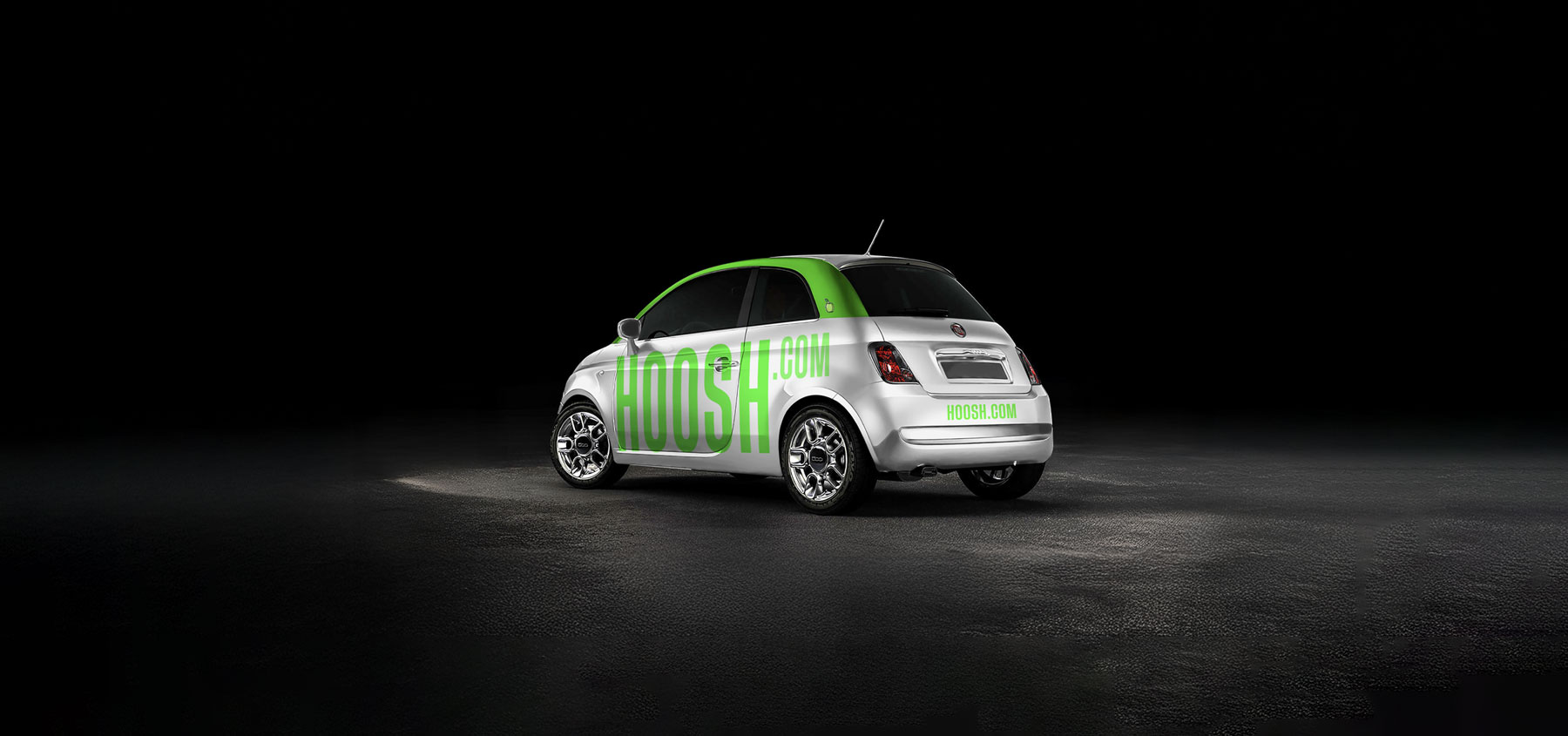
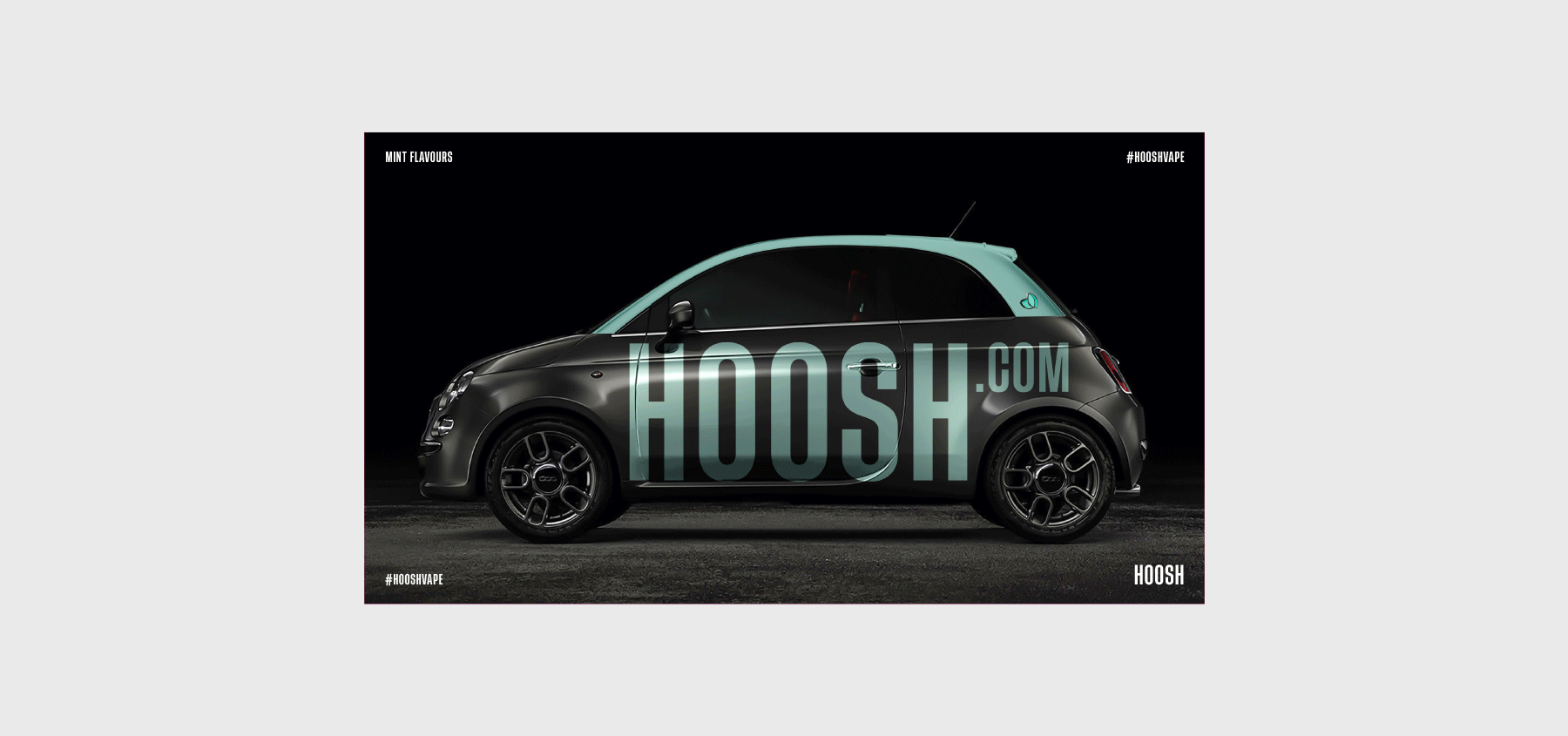
I designed the complete car branding concept for Hoosh, utilizing the Tusker Grotesk typeface to establish a bold visual presence. The concept incorporated vibrant icon sets and color-coded system variations to ensure distinct and impactful branding.
Bold Car Identity
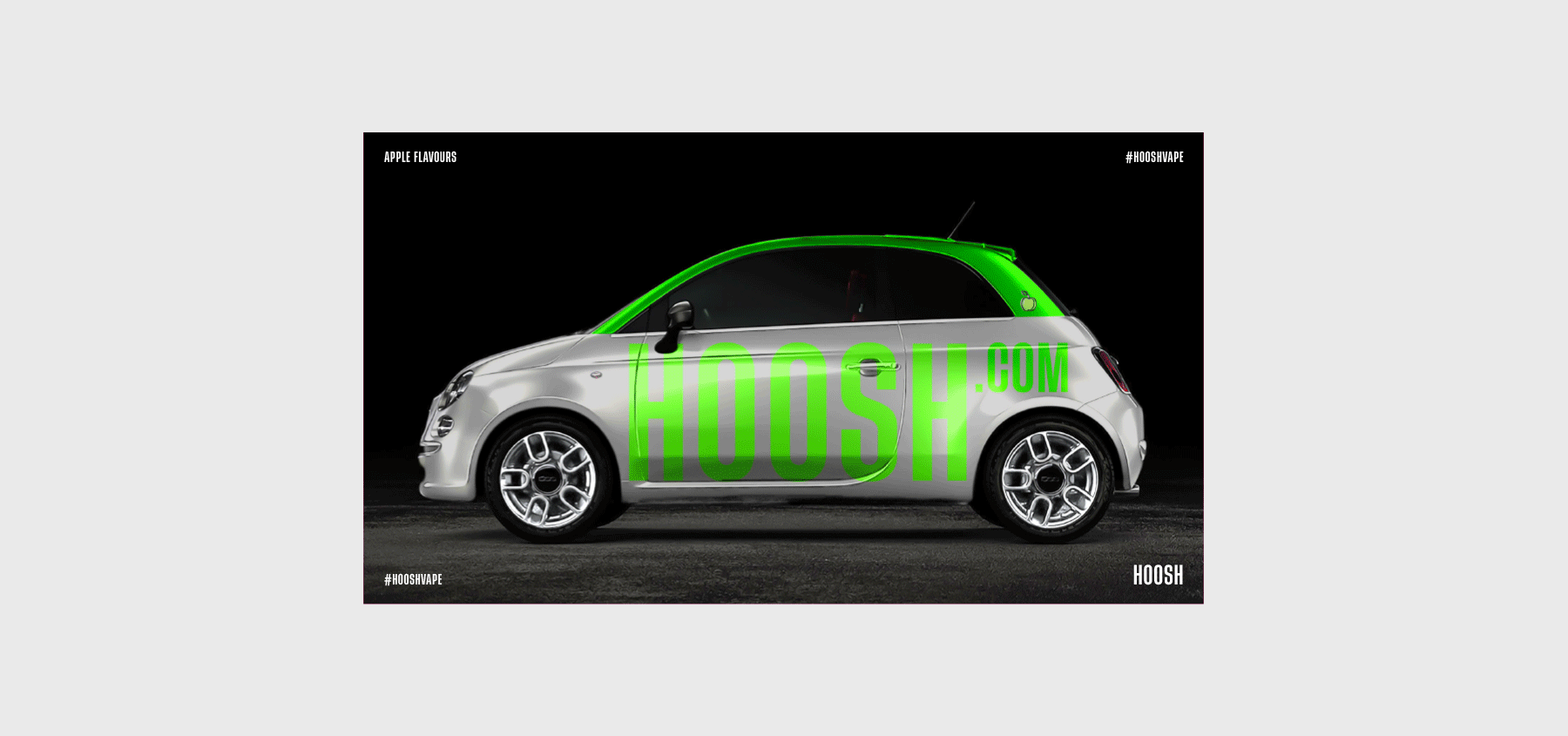
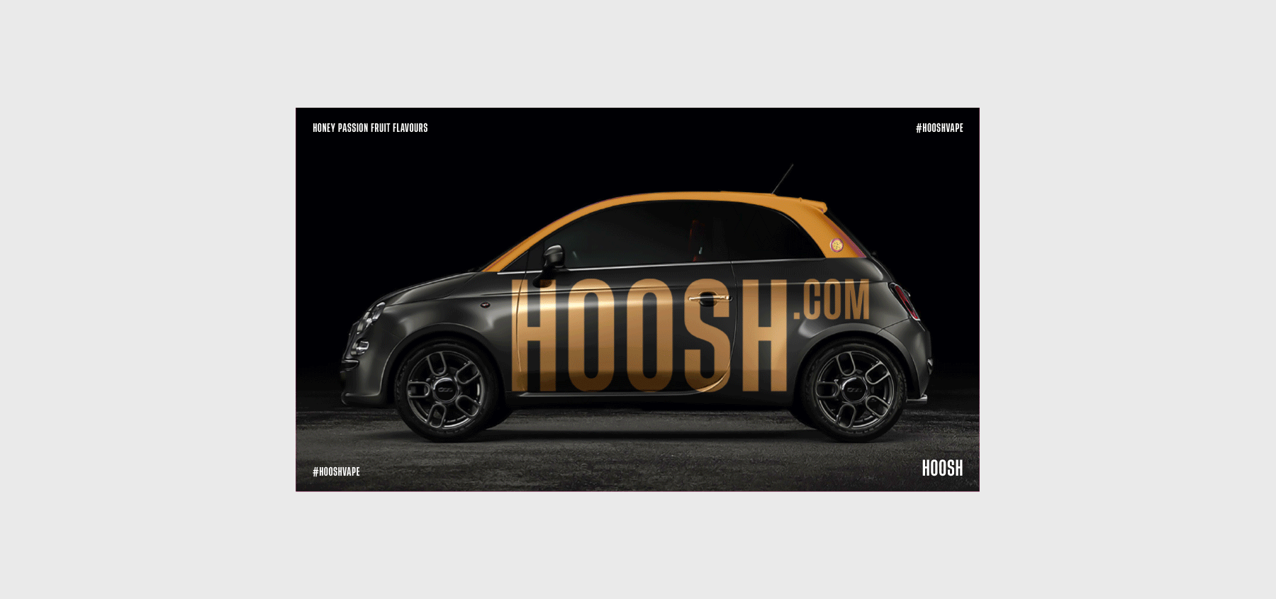
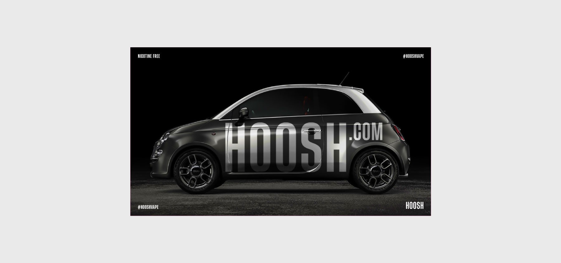
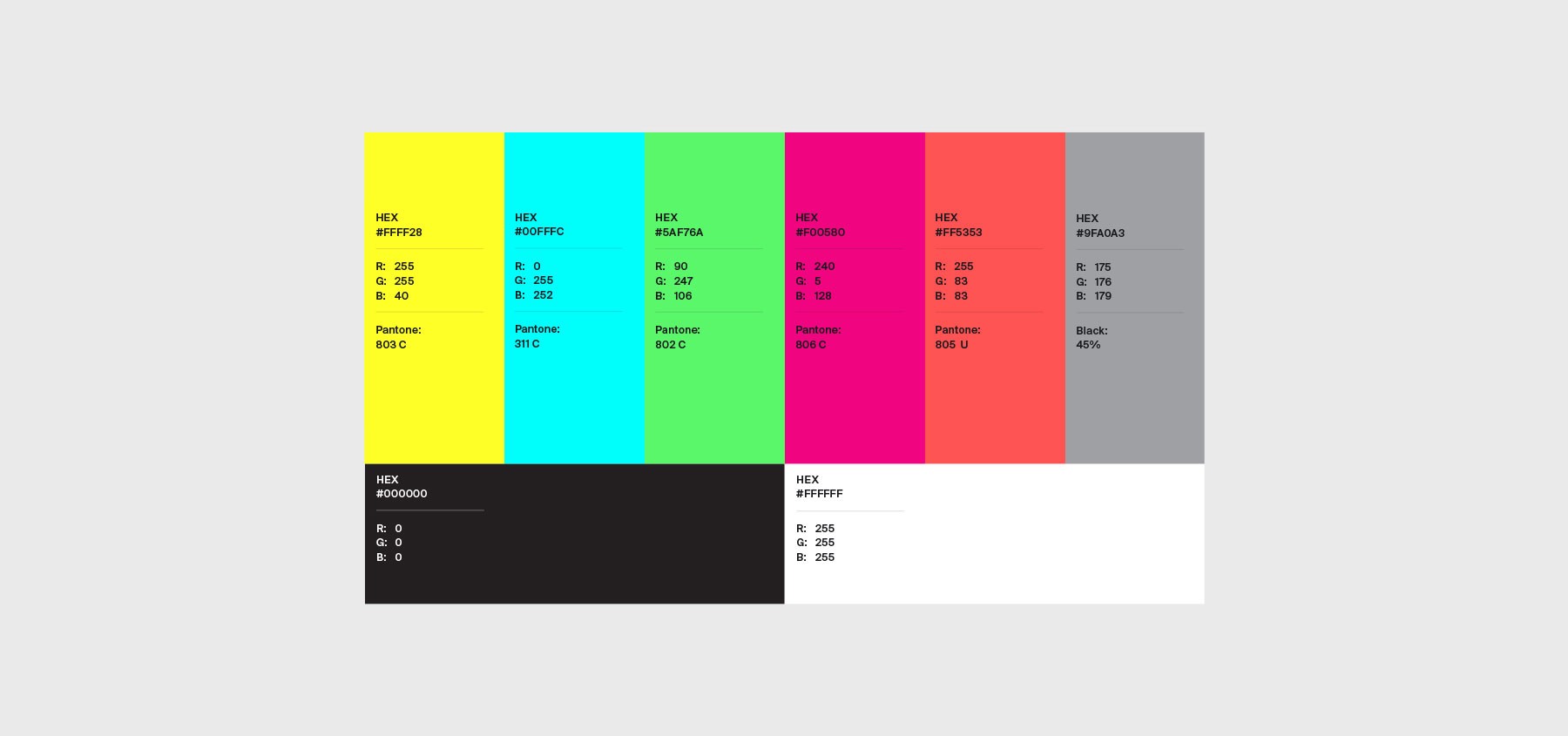
The Hoosh car branding project demanded a truly confident visual system. I built every element around the Tusker Grotesk typeface, chosen for its clean, heavy, and bold characteristics. The brand palette utilized a comprehensive range of colors, including yellow, blue, red, green, pink, grey, black, and white, applied consistently across all layouts. To ensure brand content consistency, I also created unique flavor icons and lockups for car wraps and packaging.

Layout & Typography
Layout & Typography
Tusker Grotesk proved to be the ideal typeface for this project, offering stacked, wide, and compressed options. This versatility was crucial for achieving a sharp layout rhythm and ensuring bold logo positioning within the design.
All layouts were meticulously built in Adobe InDesign, employing a grid system to ensure strong visual hierarchy and clean spacing. Tusker Grotesk provided significant visual strength, complemented by icons and flavor blocks that added crucial structure. Every label and brand element was treated with the importance of a headline designed to be readable at a distance, emotionally engaging, and consistently on-brand.


Icon System Logic
Icon System Logic
Flavor icons were meticulously designed with and without grey keylines, a visual distinction directly tied to their nicotine or non-nicotine usage protocols. This ensured immediate visual clarity for the user.
Using Adobe Illustrator, I meticulously crafted every flavor icon with flat, vector clarity. Icons incorporated keylines for black or nicotine packaging to ensure optimal contrast. For white or non-nicotine designs, these keylines were removed. All icons were exported in multiple versions, maintaining master file consistency and scalability across all car branding assets.
Photoshop for Mockups
Photoshop for Mockups
For final presentations, I developed custom mockups, incorporated retouched visuals, and created layered compositions to facilitate clear and impactful client approvals.
I created and enhanced all mockups using Adobe Photoshop. I started with downloaded templates, then meticulously retouched, resized, and layered each element to achieve a premium and realistic feel. These high-fidelity mockups were crucial for presenting full car branding directions to the team, clearly illustrating layout intent, icon placement, and the bold impact of the system on actual surfaces.
More Works
©2024
More Works
©2024


FAQ
FAQ
01
What is your design experience?
02
What design disciplines do you specialize in?
03
How do you approach design challenges?
04
Do you use AI tools in your design process?
05
What tools do you master?
06
How do you stay innovative in design?
07
Why should clients choose you?
08
How can we get started?
2023
Hoosh Cars
This project involved crafting a bold identity through the strategic use of layered mockups, vibrant icon systems, and high-impact layouts. The distinctive Tusker Grotesk typeface was central to defining its visual character.
Media Kit
Digital & Print
Know More
I designed the complete car branding concept for Hoosh, utilizing the Tusker Grotesk typeface to establish a bold visual presence. The concept incorporated vibrant icon sets and color-coded system variations to ensure distinct and impactful branding.
Bold Car Identity
The Hoosh car branding project demanded a truly confident visual system. I built every element around the Tusker Grotesk typeface, chosen for its clean, heavy, and bold characteristics. The brand palette utilized a comprehensive range of colors, including yellow, blue, red, green, pink, grey, black, and white, applied consistently across all layouts. To ensure brand content consistency, I also created unique flavor icons and lockups for car wraps and packaging.
Layout & Typography
Tusker Grotesk proved to be the ideal typeface for this project, offering stacked, wide, and compressed options. This versatility was crucial for achieving a sharp layout rhythm and ensuring bold logo positioning within the design.
All layouts were meticulously built in Adobe InDesign, employing a grid system to ensure strong visual hierarchy and clean spacing. Tusker Grotesk provided significant visual strength, complemented by icons and flavor blocks that added crucial structure. Every label and brand element was treated with the importance of a headline designed to be readable at a distance, emotionally engaging, and consistently on-brand.
Icon System Logic
Flavor icons were meticulously designed with and without grey keylines, a visual distinction directly tied to their nicotine or non-nicotine usage protocols. This ensured immediate visual clarity for the user.
Using Adobe Illustrator, I meticulously crafted every flavor icon with flat, vector clarity. Icons incorporated keylines for black or nicotine packaging to ensure optimal contrast. For white or non-nicotine designs, these keylines were removed. All icons were exported in multiple versions, maintaining master file consistency and scalability across all car branding assets.
Photoshop for Mockups
For final presentations, I developed custom mockups, incorporated retouched visuals, and created layered compositions to facilitate clear and impactful client approvals.
I created and enhanced all mockups using Adobe Photoshop. I started with downloaded templates, then meticulously retouched, resized, and layered each element to achieve a premium and realistic feel. These high-fidelity mockups were crucial for presenting full car branding directions to the team, clearly illustrating layout intent, icon placement, and the bold impact of the system on actual surfaces.
More Works
©2024
FAQ
01
What is your design experience?
02
What design disciplines do you specialize in?
03
How do you approach design challenges?
04
Do you use AI tools in your design process?
05
What tools do you master?
06
How do you stay innovative in design?
07
Why should clients choose you?
08
How can we get started?
2023
Hoosh Cars
This project involved crafting a bold identity through the strategic use of layered mockups, vibrant icon systems, and high-impact layouts. The distinctive Tusker Grotesk typeface was central to defining its visual character.
Media Kit
Digital & Print
Know More
I designed the complete car branding concept for Hoosh, utilizing the Tusker Grotesk typeface to establish a bold visual presence. The concept incorporated vibrant icon sets and color-coded system variations to ensure distinct and impactful branding.
Bold Car Identity
The Hoosh car branding project demanded a truly confident visual system. I built every element around the Tusker Grotesk typeface, chosen for its clean, heavy, and bold characteristics. The brand palette utilized a comprehensive range of colors, including yellow, blue, red, green, pink, grey, black, and white, applied consistently across all layouts. To ensure brand content consistency, I also created unique flavor icons and lockups for car wraps and packaging.
Layout & Typography
Tusker Grotesk proved to be the ideal typeface for this project, offering stacked, wide, and compressed options. This versatility was crucial for achieving a sharp layout rhythm and ensuring bold logo positioning within the design.
All layouts were meticulously built in Adobe InDesign, employing a grid system to ensure strong visual hierarchy and clean spacing. Tusker Grotesk provided significant visual strength, complemented by icons and flavor blocks that added crucial structure. Every label and brand element was treated with the importance of a headline designed to be readable at a distance, emotionally engaging, and consistently on-brand.
Icon System Logic
Flavor icons were meticulously designed with and without grey keylines, a visual distinction directly tied to their nicotine or non-nicotine usage protocols. This ensured immediate visual clarity for the user.
Using Adobe Illustrator, I meticulously crafted every flavor icon with flat, vector clarity. Icons incorporated keylines for black or nicotine packaging to ensure optimal contrast. For white or non-nicotine designs, these keylines were removed. All icons were exported in multiple versions, maintaining master file consistency and scalability across all car branding assets.
Photoshop for Mockups
For final presentations, I developed custom mockups, incorporated retouched visuals, and created layered compositions to facilitate clear and impactful client approvals.
I created and enhanced all mockups using Adobe Photoshop. I started with downloaded templates, then meticulously retouched, resized, and layered each element to achieve a premium and realistic feel. These high-fidelity mockups were crucial for presenting full car branding directions to the team, clearly illustrating layout intent, icon placement, and the bold impact of the system on actual surfaces.
More Works
©2024
FAQ
What is your design experience?
What design disciplines do you specialize in?
How do you approach design challenges?
Do you use AI tools in your design process?
What tools do you master?
How do you stay innovative in design?
Why should clients choose you?
How can we get started?